Top Things To Look For In A Graph Maker
There are many reasons for creating graphs. For example, it might be to help visualize or explain data, demonstrate various aspects of something or simply to make your points more easily digestible by your audience. The way in which information is presented influences its understanding and interpretation; therefore, it is important to make appropriate use of presentation tools.
In order to create a graph that will have a significant impact on the reader or viewer, you need to pay attention to certain specifics when choosing an online graph maker and using it.
Here are some key things to look for:
-
Type of Graphs

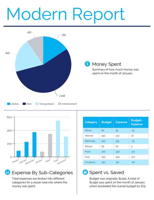
There are many types of charts and graphs and they vary in the way they present data. For example, bar graphs convey data by comparing lengths of different bars, enabling the reader to determine which is longer or shorter. Pie charts are used to show the proportions of a whole by using circular segments that reach the center of the graph. Their sizes are determined by the quantity they represent.
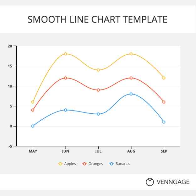
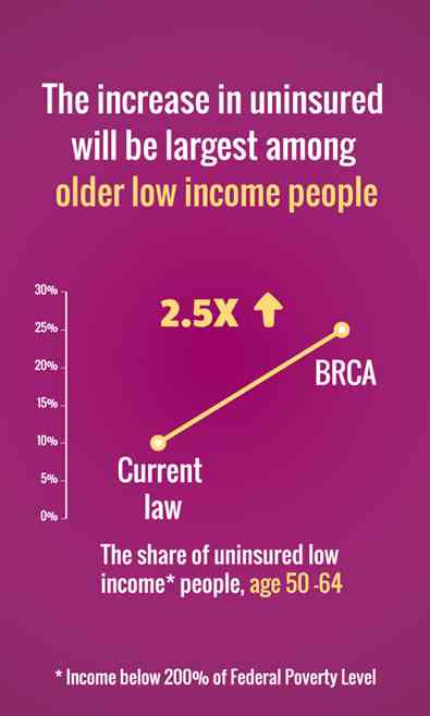
Sometimes, these two types are combined in order to compare length and proportions at once (which can be done on one axis), such as when showing how much of the whole certain groups make up. Line graphs are used to emphasize trends over time, presenting information visually along a line that connects two consecutive points in order to enable easier understanding or comparison between them.
-
Frequency of Updating and Editing
Another important thing to pay attention to depending on how frequently you will need to update and edit your graph is whether you can do it easily. Such as, if you have access to online tools that enable re-editing without getting access again from the hosting company’s server after your subscription expires, as an example.
-
Breadth
Beyond what type of graph is appropriate for your subject matter, you should also consider what data you are trying to present. You might want to know how certain factors influence another or see how two variables change throughout time.
If your subject is health, for example, it would be useful to look at the relationship between weight and height over different age groups in order to determine if there are any correlations. Or you might want to create a graph with one variable representing values on both the X-axis and Y-axis, like when showing the number of times something happened alongside its associated value.
Some graphs aren’t used often but can still be helpful. There are algorithms that can help with creating them upon request by taking into account multiple factors such as water flow rate, sewer size and other parameters.
-
Scale

Depending on what you are trying to show, it is important to decide whether the scale should start at 0 or not. This question should be asked in order to avoid confusion when looking at graphs that don’t have a clearly defined starting point.
Scales that span over 1 unit will provide more detailed information but can result in graphs where each data point covers a greater area. This makes it harder to see patterns within the graph itself.
-
Labels/Legends/Titles
All of these are useful for clarity reasons. The legend should include all symbols used in the graph while titles should provide an additional explanation about specific aspects of the graph if necessary. Labels are useful for pointing out specific elements of the graph that are important, especially when it comes to maps where location is being represented.
-
Colors
Depending on what you are trying to convey, using different colors can evoke certain emotions. For example, red is used in bar graphs showing economic data. Meanwhile, green shows growth while blue might represent cost.
Even if your graph maker offers tons of color choices, try not to overuse colors since they are intended for emphasis or particularly relevant aspects.
-
Font Choice

This does not only pertain to the font used but also how it is presented. Make sure there is enough contrast between colors so that it doesn’t become too hard for your audience to focus on what’s most important.
Some final words of advice: the more similar your topics of choice are, the easier it will be to create a graph that is useful for your audience. If you are wanting to compare several variables, then consider using bivariate graphs since they allow for direct comparison between two sets of data.
Finally, don’t be afraid to experiment! The more you practice the better you will get. If you are unsure about what your graph looks like to other people, get feedback from others before submitting it. This sounds simple but can be pretty helpful when looking at your final product.
Finding the best graph maker matters. If you’re unsure where to get started, check out Venngage today. The platform has everything you need to make an effective graph for your next presentation. It even has tons of infographics templates!


