5 Responsive Email Design Tips
Modern problems require modern solutions. And, when it concerns email designs, you need to be spot on to communicate precise and call-to-action details. Speaking of which, consumers are increasingly moving mobile for their interactions and communications needs. Another element that plays a significant part in such environments is a responsive email. While you draft an email to your colleague for newsletters or simply to reach out to someone, it needs to be device-specific and optimized.
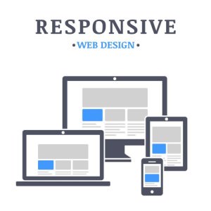
Responsive emails adapt to several screen resolutions with wholesome functionality, enabling readers and recipients to read through their devices without missing out on any feature or content section. Designing an efficient and effective responsive email starts with creating a better recipient experience. More often, marketers aim to create and produce emails that look great and boost conversion rates. To know more, here is a rundown of some of the best responsive email design tips.
1. An email should be a teaser.

Since you want to communicate about many things like the newest product, upcoming event, company announcement, or biggest sale, your responsive email isn’t the right place to get into details. You need to think of your email as a teaser. Before a reader taps on the call-to-action button, the email should provide you with enough details. Remember, the message should be focused, to the point, and short, leading readers to the CTA.
2. Create a sense of hierarchy.
Create organization and focus in your responsive email by narrating a story in a hierarchical fashion. Think about how you can structure the message or content utilizing the inverted pyramid model. The section you are writing about should begin with compelling and attractive visual content, followed by shorter ones, surrounded with bold and supportive headlines and texts.
Such factors can lead a reader to the CTA button, making it clear for them about what to expect and do next. Moreover, it is an excellent yet efficient way to communicate and get click-throughs with shorter attention spans.
3. Give specific thought to images.
Didn’t you know that images and visual text are ideal for making your emails more attractive and dynamic, all at the same time? However, when it comes to responsive email designs, pictures and visual representations can be one’s worst enemy. How? Only if you choose them incorrectly! Attaching or embedding overly large images can run the risk of an email not displaying them properly or loading them slowly. And, if you go for smaller ones, it may not deliver a concise message, leading to pixelated or distorted images. Besides, be prepared for the worst. Some people disable email images, so you may have to take everything under consideration.
If an image does not load or show in the email, the reader may only observe the ALT text, allowing them to understand the mail even without any image. For such a reason, one should always utilize a balance between images and text.
4. An email is not your website.
A succinct, focused email should always be designed with clarity and communicate a single CTA. As a result, you shouldn’t crowd an email or even a header, such as menus, extraneous links, and messages.
Try to follow the simplicity route and use the data to make specific customizations. The mailing list should follow a different strategy. It is not your website. Since you have the data of all your subscribers, use it to tailor your campaign versions for targeted, segmented portions to improve conversion rates.
For someone who wants to create responsive and professional email marketing templates for various clients and reader lists without any HTML skills, check out Stripo.email. Stripo allows you to test your email template in over 90 popular environments before shooting it across.
5. Utilize Animated GIFS.
Using an animated GIF in your responsive email can add a sturdy yet creative visual storytelling element. While Outlook is one of the most prominent exceptions here, the 2007 and newer versions may only show the first frame of the GIF, leading to no animation. So, plan ahead while designing anything of this sort. For example, Banana Republic makes use of a question mark in the first frame of the GIF, allowing readers to understand the message easily.


